• About
  • Design Systems & UX
  • Identity
  • Print
Menu

Erin Horvath Design

  • About
  • Design Systems & UX
  • Identity
  • Print

The North Face | Mobile

The North Face is an outdoor recreation products company. They believe exploration creates an indelible bond with the outdoors, inspiring people to protect our land and pass these beliefs down to the next generation.

ROLE
UX Designer with a main focus on the Design System to support the Mobile Design team.

OBJECTIVE
To design a sleek and functional native mobile app for The North Face that captures the brand's identity. The app will provide users with a seamless shopping experience, personalized content and easy access to the latest collections, while fostering a sense of community among The North Face users.

CHALLENGE
To move the webviews to a native platform all while keeping with the same look and feel of the website.

PROCESS
Since these screens were created in Sketch, I had to move all of our Sketch files over to Figma. I then made new component of all of our assets to streamline the design process.

We then worked with our PO's and Dev team to figure out which screens will be developed first and divided that work into two week sprints. Once we determined which screens we would work on first, we did a competitor analysis and moved into wireframing.

OUTCOME
We enhanced user experience by providing smoother and faster performance, improved accessibility, increased engagement through challenges and push notifications, saw a higher conversion rate and enhanced brand loyalty.

Native implementation increased mobile conversion from 1-2% to an average of 6-7% of total revenue. App ratings went up about an average of an entire star for both android and iOS.

TNF_home_shop.png
TNF_plp_pdp.png
TNF_cart_checkout.png
TNF_xplrpass_account.png

The North Face & Vans | Mobile Global Design System

OBJECTIVE
We needed to create a global design system for The North Face and Vans iOS and Android Mobile app utilizing Figma tokens to ensure consistency and efficiency across both brands.

ROLE
Design System Governance - creating the atoms, molecules, and organisms of the design system to be used by other designers and developers.

CHALLENGE
Creating global tokens for both brands that can be switched out easily depending on what mode they are in.

PROCESS
We worked in a two-week sprint format to compile research findings, define constraints with development, conduct user testing, build component libraries, create documentation, and present the finished segments to the team and all stakeholders.

OUTCOME
Designers & developers were freed from having to recreate components each time they started a new design segment. The designs were more consistent between both brands and operating system by utilizing the design system library & templates.

Global DS.png

Vans | Mobile

Vans is an American manufacturer of skateboarding shoes and related apparel, established in Anaheim, California, and owned by VF Corporation.

ROLE
UX Designer with a main focus on the Design System to support the Mobile Design team.

OBJECTIVE
To design a sleek and functional native mobile app for Vans that captures the brand's iconic, off-the-wall identity. The app will provide users with a seamless shopping experience, personalized content and easy access to the latest collections, while fostering a sense of community among Vans users.

CHALLENGE
To move the webviews to a native platform all while keeping with the same look and feel of the website.

PROCESS
Since these screens were created in Sketch, I had to move all of our Sketch files over to Figma. I then made new component of all of our assets to streamline the design process.

We then worked with our PO's and Dev team to figure out which screens will be developed first and divided that work into two week sprints. Once we determined which screens we would work on first, we did a competitor analysis and moved into wireframing.

OUTCOME
We enhanced user experience by providing smoother and faster performance, improved accessibility, increased engagement through challenges and push notifications, saw a higher conversion rate and enhanced brand loyalty.

Native implementation increased mobile conversion from 1-2% to an average of 6-7% of total revenue. App ratings went up about an average of an entire star for both android and iOS

Vans_home_account.png
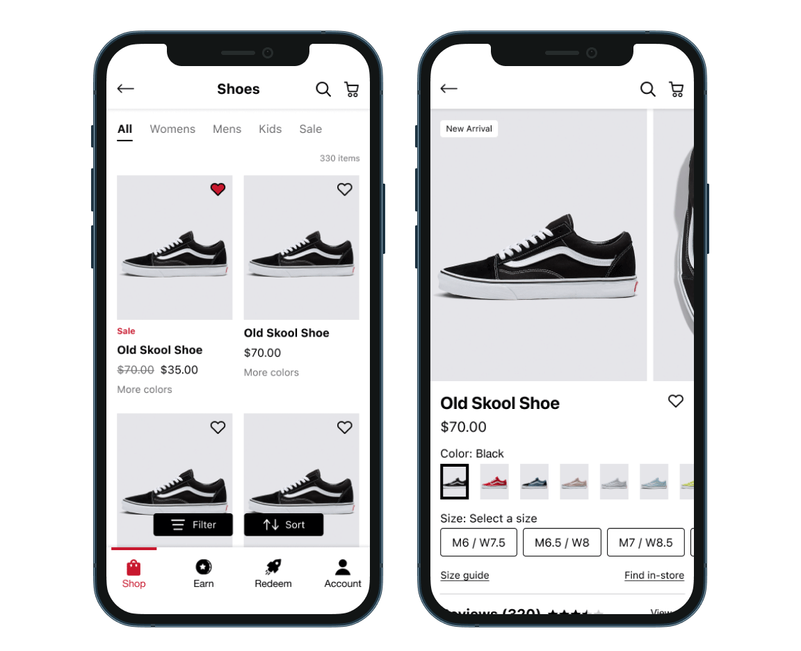
Vans_plp_pdp.png
Vans_cart_checkout.png
Vans_profile_interests.png

Smartwool, Altra, Dickies | Design Systems

Dickies, Smartwool and Altra represent a unique blend of durability, comfort and innovation across workwear, performance apparel and footwear.

ROLE
Design System Governance - creating the atoms, molecules, and organisms of the design system to be used by other designers and developers.

OBJECTIVE
We needed to create a design system to ensure consistency across all three brands websites when utilized by designers and developers.

CHALLENGE
To perform an overall audit to determine inconsistencies, one-off components and outdated designs of what is currently on their websites. Once the audit was concluded, we would have a deeper understanding of where our current system fell short.

PROCESS
We based our Content Modules & Product Cards off of Dickies templates that were created by an outside agency. We then created new components based off of best practices, our brand guidelines and the needs of each brand.

OUTCOME
Designers were freed up from having to recreate components each time they started a new design and developers had the correct pre-built components. The designs were more consistent throughout the brands by utilizing our Design System and the brands had multiple template variations to choose from.

EB DS.png

Spur | Mobile

Spur Experiences is a registry for experiences. Collect moments, not things.

ROLE
Lead UI Designer

OBJECTIVE
To redesign the Spur Mobile experience so it’s more accessible, simplified and easier to use and is more on brand with the website design.

CHALLENGE
The navigation and typography weren’t accessible and had too many CTA buttons. The user found it difficult to know which screens they were on due to lack of headers and navigating throughout the app.

PROCESS
I started with a competitor analysis and then went on to create the wireframes. After the wireframes were approved by the client I started creating the designs.

OUTCOME
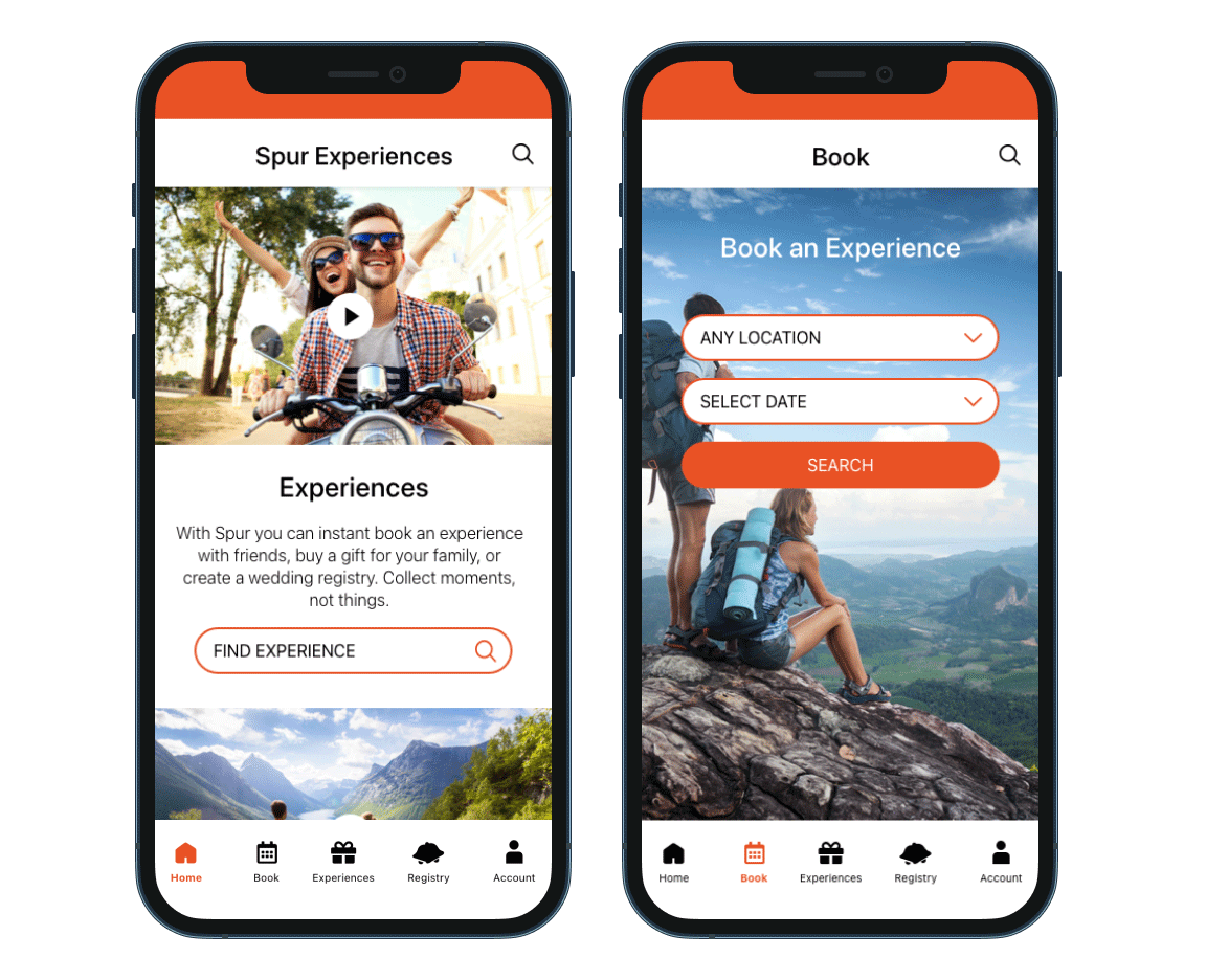
Adding a clear bottom tab navigation and a top navigation bar allowed the user to understand where they were on different screens. Adding new typography styles gave the app a cleaner look that was easier to read and understand. The CTA buttons are accessible and easier to tap. Overall the app is more cohesive with the website design and is easier for the user to move throughout screens.

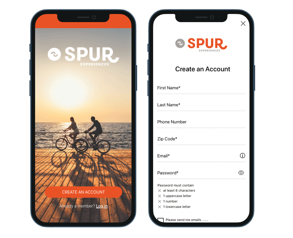
Spur_Sign-in_create-account.png
Spur_Home_book.png
Spur Mobile Wireframes.png
Spur Mobile New.png
Spur Mobile Old.png

The North Face | Mobile Design System

The North Face is an outdoor recreation products company. They believe exploration creates an indelible bond with the outdoors, inspiring people to protect our land and pass these beliefs down to the next generation.

ROLE
Design System Governance - creating the atoms, molecules, and organisms of the design system to be used by other designers and developers.

OBJECTIVE
We needed to create a design system to ensure consistency across the mobile application when utilized by designers and developers.

CHALLENGE
To perform an overall audit to determine inconsistencies, one-off components and outdated designs of what is currently in app. Once the audit was concluded, we would have a deeper understanding of where our current system fell short.

PROCESS
We worked in a two-week sprint format to compile research findings, define constraints with development, conduct user testing, build component libraries, create documentation, and present the finished segments to the team and all stakeholders.

OUTCOME
Designers were freed up from having to recreate components each time they started a new design and developers had the correct pre-built components. The designs were more consistent throughout the app by utilizing our Design System.

TNF_DS.jpg
tnf_fields.png
tnf_navigation.png

Spur | Mobile Checkout

Spur Experiences is a registry for experiences. Collect moments, not things.

ROLE
Lead UI Designer

OBJECTIVE
Redesign the webview cart & checkout process to be more user friendly and esthetically pleasing.

CHALLENGE
To simplify the Cart and Checkout flow so it’s easier for the user to understand and use.

PROCESS
I started with a competitor analysis and then went on to create the wireframes based off of the current webview designs. After those were approved by the client I started creating the designs.

OUTCOME
I simplified the layout so the user was able to move through the checkout process smoother by adding more white space, large headers and a simple pagination so you know what screen you’re on and larger CTA buttons that will be anchored at the bottom of the screen. The user new which step they were on and found it easier to go through the checkout process.

Spur_Checkout_Cart_Purchaser.png
Spur_Checkout_Voucher_Payment.png
Spur Checkout Old.png

Vans | Mobile Design System

Vans is an American manufacturer of skateboarding shoes and related apparel, established in Anaheim, California, and owned by VF Corporation.

ROLE
Design System Governance - creating the atoms, molecules, and organisms of the design system to be used by other designers and developers.

OBJECTIVE
We needed to create a design system to ensure consistency across the mobile application when utilized by designers and developers.

CHALLENGE
To perform an overall audit to determine inconsistencies, one-off components and outdated designs of what is currently in app. Once the audit was concluded, we would have a deeper understanding of where our current system fell short.

PROCESS
We worked in a two-week sprint format to compile research findings, define constraints with development, conduct user testing, build component libraries, create documentation, and present the finished segments to the team and all stakeholders.

OUTCOME
Designers were freed up from having to recreate components each time they started a new design and developers had the correct pre-built components. The designs were more consistent throughout the app by utilizing our Design System.

Vans_DS.jpg
vans_fields.png
vans_navigation.png

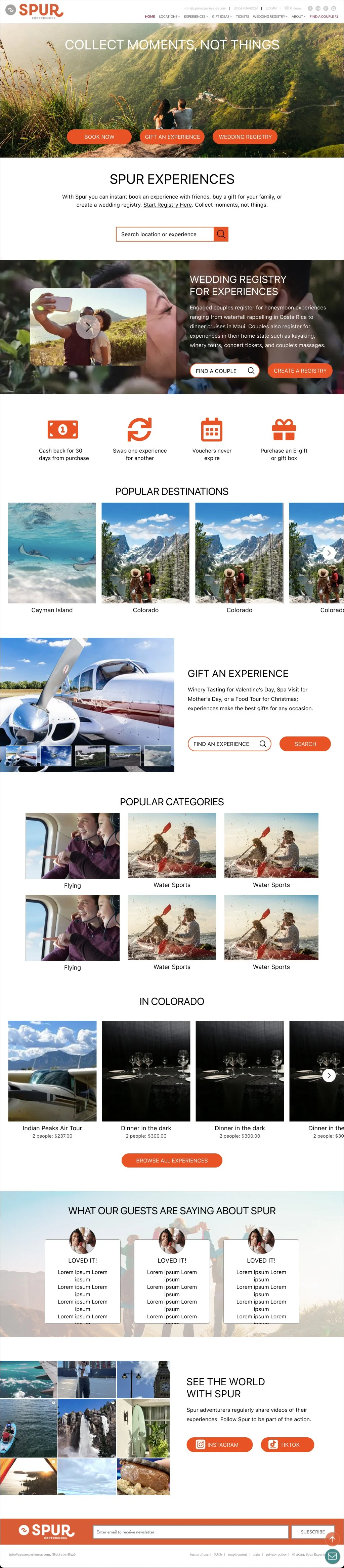
Spur | Website

Spur Experiences is a registry for experiences. Collect moments, not things. https://spurexperiences.com/

ROLE
UI Designer

OBJECTIVE
To redesign the Spur Website experience so it’s more accessible, simplified and easier to use for their users.

CHALLENGE
The navigation, typography and CTA buttons weren’t accessible and it was hard for users to navigate.

PROCESS
I started with a competitor analysis and then went on to create the wireframes. After the wireframes were approved by the client I started creating the designs.

OUTCOME
Adding a clear hierarchy to the screen made it easier for the user to navigate. Adding a white background made the typography easy to view and read. Utilizing cells and fewer CTA button helped guide the user to complete the purchase.

Spur's Home Page
Spur's Home Page
Spur website New.png
Spur website Old.png

Fetal Health Foundation | Website

The Fetal Health Foundation supports families receiving a fetal syndrome diagnosis, funds life-saving research, increases fetal syndrome awareness, and shares leading medical information on fetal syndromes.

ROLE
UI Designer

OBJECTIVE
To design an updated website that enhances user experience, improves accessibility and has helpful content for the user.

CHALLENGE
We need to create a website that is visually appealing and functional.

PROCESS
I started with a competitor analysis and then started sketching with pencil on paper.

OUTCOME
The clear headers and white space allowed the user to move through the website with ease. The imagery and icons were helpful in visually telling the Fetal Health’s story.

Fetal Health Foundation website home_r7.jpg
FetalHealth_11_AboutUs.jpg

Running Denver | Website

Running Denver is now Hal Sports, which takes the "Crazy" out of organizing events. With two decade of experience, we put on 5Ks, multi-day races, and more.

ROLE
UI Designer

OBJECTIVE
To design an updated website that enhances user experience, improves accessibility and effectively showcases the brand's offerings. The new website should cater to both seasoned runners and beginners, engaging content and information about running events in Denver.

CHALLENGE
Designing a website that caters to a diverse audience, from seasoned runners to beginners. Balancing aesthetic appeal with functionality to create a site that is both visually engaging and easy to use.

PROCESS
I started with a competitor analysis and then moved to wireframing. Once the wireframes were approved by the UX team, I added images, color and copy.

OUTCOME
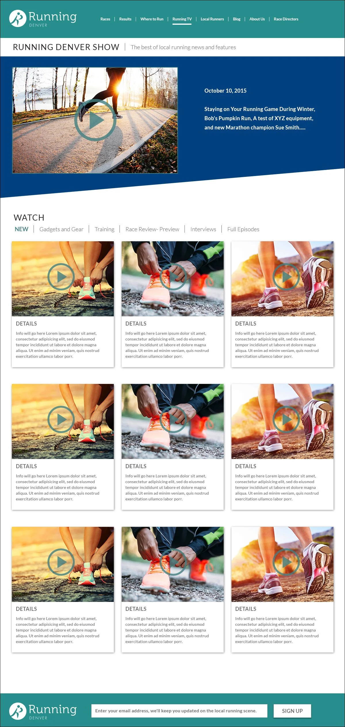
The full page images at an angle gave a more modern look to the website. The icons made it easier for the user to get all of the information that they needed for each run.

RunningDenver_website_r6.jpg
RunningDenver_website_r6_2.jpg

Target | Email

OBJECTIVE
To create an email that effectively promotes Targets REDPerks program by clearly communicating its value proposition to Target customers.

ROLE
UI Designer

CHALLENGE
The design needs to be visually appealing, easy to navigate and include a compelling call-to-action that motivates the user to download the REDPerks app.

PROCESS
To understand the primary audience and determine what motivates them such as savings, exclusive deals or convenience. I worked closely with the writer and creative director to ensure that we follow Targets strict brand guidelines.

OUTCOME
The numbers of downloads for the REDPerks beta test was successful and had a significant increase in downloads. The email also enhanced customer awareness of the REDPerks program.

Target_Emails.jpg
Target_Invite_Email_600_NEW2.jpg
prev / next
Back to Design Systems & UX
4
The North Face | Mobile
1
The North Face & Vans | Mobile Global Design System
4
Vans | Mobile
1
Smartwool, Altra, Dickies | Design Systems
5
Spur | Mobile
3
The North Face | Mobile Design System
3
Spur | Mobile Checkout
3
Vans | Mobile Design System
Spur's Home Page
3
Spur | Website
2
Fetal Health Foundation | Website
2
Running Denver | Website
2
Target | Email

©2026 Erin Horvath Design